Site width restrains all content on a page at the center of a page in a certain width, it works as if there is an invisible boundary on both sides. Our premium themes support two kinds of site width, Fixed or Percentage. A fixed width layout restrains all page content in the area by a solid value, it doesn’t change on screens. While a percentage width layout changes from screen to screen, expands on larger ones and reduces on the opposite. This tutorial shows you how to change the site width (fixed width or percentage), how to change that on mobile and finally, how to change it on a per page basis.
To change site width
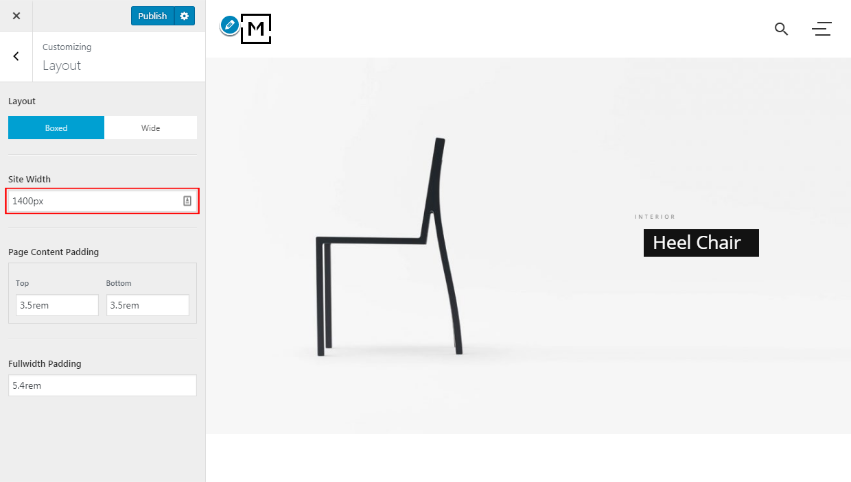
Log into your WordPress site administration panel, navigate to Appearance > Customize, then Layout.
In the Site Width option box, enter a valid CSS unit, e.g. 1200px for a fixed width, or 70% for a percentage width. Changes on the option will take effect in the live preview immediately, however you may not see it when the values are larger than the live preview area.
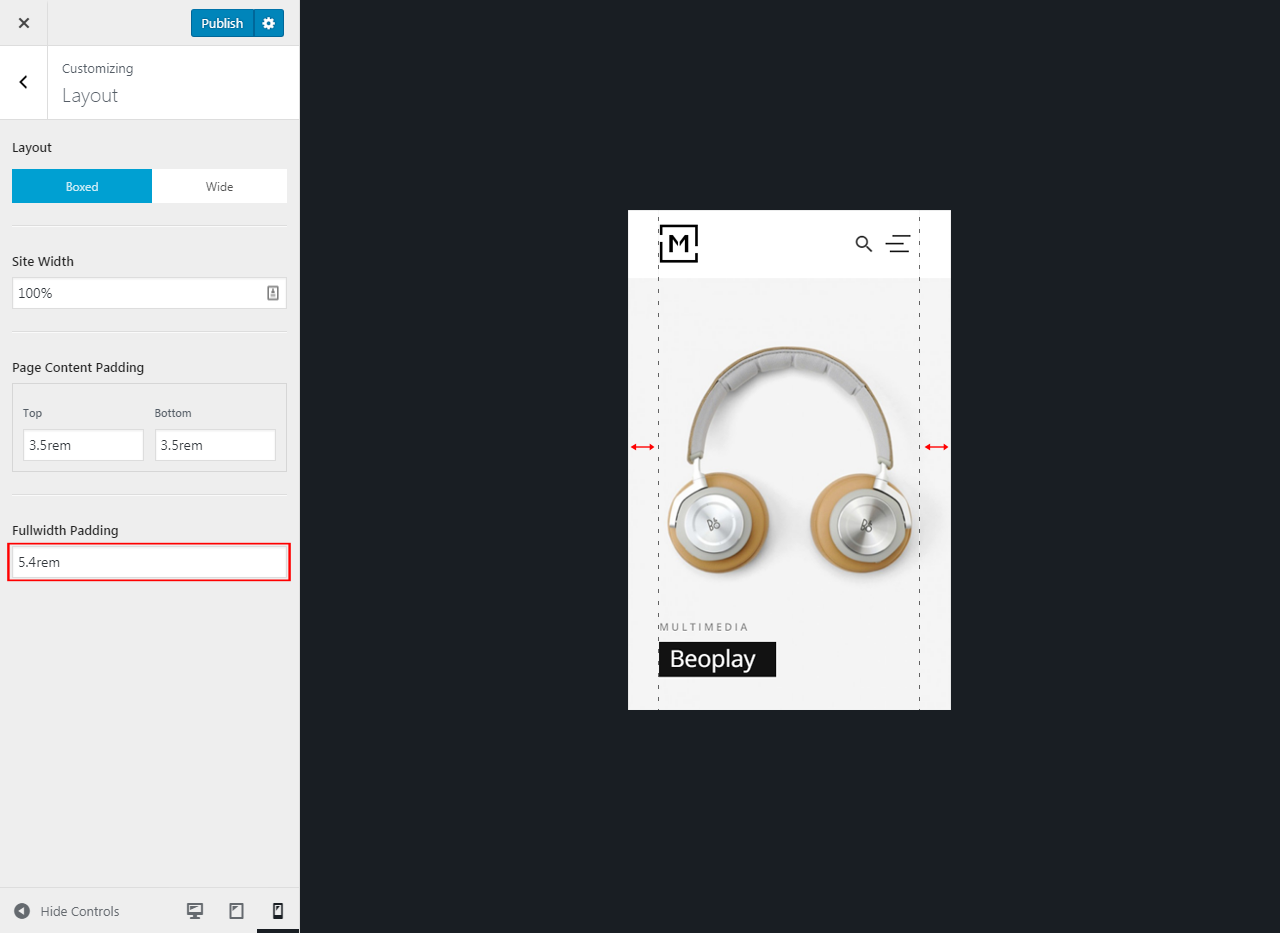
Site width on mobile
On mobile devices (smartphones, tablets, etc.) or a screen smaller than the width we set above, the site width is decided by the option Fullwidth Padding. Reducing the option value to increase your site width on mobile, or vice versa.
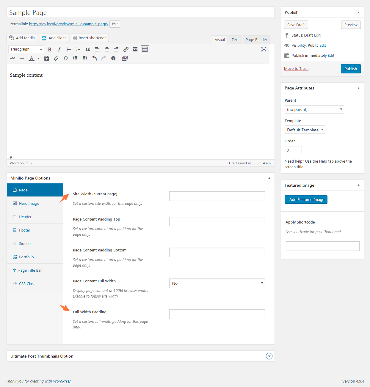
Site width on a per-page basis
If you want to set a different site width or full-width padding for a specific page, you can do that in theme page options panel. These settings affect current page only.